Creating a table of content widget in React
Want to learn how to create your own in-page table of content widget? Look no further.
Today, we’re going to do something fun. We’re going to create a widget that shows all the headings on a page, and lets us link to them.
Chances are, you’ve probably seen this kind of widget before. Most documentation sites use these as an intra-site navigation, and let you scroll to the correct part of the page with a quick click. And - on some particularly fancy pages - you might notice that the current section is highlighted whenever you scroll to it!
It’s definitely neat to look at - but how do you even start creating something like that yourself? This article is going to take you through each part, so that if you ever need to make your own, you at least know where to start.
Step 1: Finding the headings
To even get started with creating this nice little navigation menu, we need to figure out what to put in it. In other words, we need to find all headings in the document. Luckily, there is a great browser feature for this:
const headings = document.querySelectorAll("h2, h3, h4, h5, h6")Now, we have references to all headings in the document. Note, we’re skipping the main heading - the <h1 /> tag - because we’re creating an intra-page navigation, and including the title of the document wouldn’t make too much sense.
In order to get the names of those titles, we need to loop through them all. Now, the querySelectorAll function doesn’t return an array - but a NodeList. It’s a good API for sure, but for our use, we need to map those values into strings. You can do that in one of two ways. One is via a loop:
const headings = [];
for (let heading of document.querySelectorAll("h2, h3, h4, h5, h6")) {
  headings.push(heading.innerText);
}
Another is through this neat little trick with turning the iterable NodeList into a regular array and using the map function:
const headings = Array.from(
    document.querySelectorAll("h2, h3, h4, h5, h6")
  )
  .map(heading => heading.textContent);
I like both. Either way - you now have a neat list of headings to show!
Step 2: Listing the headings
Now that we have the headings, let’s create a component that finds those headings and lists them out.
A first iteration might look like this:
// The code from above:
function useHeadings() {
  const [headings, setHeadings] = React.useState([]);
  React.useEffect(() => {
    const elements = Array.from(document.querySelectorAll("h2, h3, h4, h5, h6"))
      .map((element) => element.textContent);
    setHeadings(elements);
  }, []);
  return headings;
}

// Now, the function that renders it all
function TableOfContent() {
  const headings = useHeadings();
  return (
    <nav>
      <ul>
        {headings.map(heading => (
          <li key={heading}>{heading}</li>
        ))}
      </ul>
    </nav>
  );
}
Now we have a neat looking list of headings that doesn’t really do much. Let’s fix that.
Step 3: Linking the headings
A table of content isn’t much fun if you can’t click it to get to the correct section, though, so let’s make that happen. But in order to link to a particular element in an HTML document, that element needs to have an ID set.
And requiring all document headings to have IDs sounds like a tedious requirement to ask of our editors - so let’s implement that as a component.
Here’s a neat implementation of such a heading component:
function Heading({ children, id, as: Element, ...props }) {
  const theId = id ?? getId(children);
  return <Element id={theId} {...props}>{children}</Element>;
}
The getId function turns the children of the component into a unique ID - either through a slugify function or something else.
Next, let’s add links to our <TableOfContents /> component:
function useHeadings() {
  const [headings, setHeadings] = React.useState([]);
  React.useEffect(() => {
    const elements = Array.from(document.querySelectorAll("h2, h3, h4, h5, h6"))
      .filter((element) => element.id)
      .map((element) => ({
        id: element.id,
        text: element.textContent ?? "",
      }));
    setHeadings(elements);
  }, []);
  return headings;
}

function TableOfContent() {
  const headings = useHeadings();
  return (
    <nav>
      <ul>
        {headings.map(heading => (
          <li key={heading.id}>
            <a href={`#${heading.id}`}>
              {heading.text}
            </a>
          </li>
        ))}
      </ul>
    </nav>
  );
}
We did two things here - we changed the useHeadings function to return both the ID and text of each heading as an object, and we added a link to each list item.
And with that, we have a linked table of content! 💪
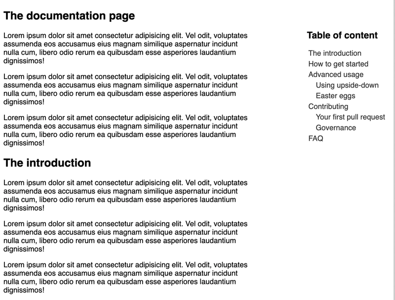
Step 4: Creating a visual hierarchy
One thing that irks me still though, is not having any idea of what’s a main heading and what’s a sub heading. So let’s fix that.
First, we need to get the heading level info from the useHeadings function:
function useHeadings() {
  const [headings, setHeadings] = React.useState([]);
  React.useEffect(() => {
    const elements = Array.from(document.querySelectorAll("h2, h3, h4, h5, h6"))
      .filter((element) => element.id)
      .map((element) => ({
        id: element.id,
        text: element.textContent ?? "",
        level: Number(element.tagName.substring(1))
      }));
    setHeadings(elements);
  }, []);
  return headings;
}
Here, we find the tagName, remove the leading h and turn the remaining string into a number.
Next, let’s add some styles to make this visual hierarchy as well!
function TableOfContent() {
  const headings = useHeadings();
  return (
    <nav>
      <ul>
        {headings.map(heading => (
          <li
            key={heading.id}
            style={{ marginLeft: `${heading.level - 2}em` }}
          >
            <a href={`#${heading.id}`}>
              {heading.text}
            </a>
          </li>
        )}
      </ul>
    </nav>
  );
}
Boom - now it looks neat as well!
Well, most of these widgets tend to get stuck up in the top right corner. So if you want to get that effect - let’s add a few more lines of styles:
function TableOfContent() {
  const headings = useHeadings();
  return (
    <nav style={{ position: 'fixed', top: '1em', right: '1em' }}>
      {...}
    </nav>
  );
}
Now this really looks the part!
Step 5: Mark the active section as active
Finally, let’s add a pretty neat feature - highlighting the currently visible heading!
To do this, we need to write a custom hook that tells us what element is in view at a given time. Here’s an implementation of just that:
export function useScrollSpy(
  ids,
  options
) {
  const [activeId, setActiveId] = React.useState();
  const observer = React.useRef();
  React.useEffect(() => {
    const elements = ids.map((id) =>
      document.getElementById(id)
    );
    observer.current?.disconnect();
    observer.current = new IntersectionObserver((entries) => {
      entries.forEach((entry) => {
        if (entry?.isIntersecting) {
          setActiveId(entry.target.id);
        }
      });
    }, options);
    elements.forEach((el) => {
      if (el) {
        observer.current?.observe(el);
      }
    });
    return () => observer.current?.disconnect();
  }, [ids, options]);
  return activeId;
}
If this makes no sense to you - that’s totally fine. Give the MDN docs a quick review. But you pass it a list of IDs, and it returns the active ID at any given time.
Let’s use this in our <TableOfContent /> component:
const activeId = useScrollSpy(
  headings.map(({ id }) => id),
  { rootMargin: "0% 0% -25% 0%" }
);
Here, we specify that whenever a particular heading is scrolled a quarter of the way into the page, we mark it as active. Here’s how that would look:
function TableOfContent() {
  const headings = useHeadings();
  const activeId = useScrollSpy(
    headings.map(({ id }) => id),
    { rootMargin: "0% 0% -25% 0%" }
  );
  return (
    <nav style={{ position: 'fixed', top: '1em', right: '1em' }}>
      <ul>
        {headings.map(heading => (
          <li key={heading.id} style={{ marginLeft: `${heading.level}em` }}>
            <a
              href={`#${heading.id}`}
              style={{
                fontWeight: activeId === heading.id ? "bold" : "normal"
              }}
            >
              {heading}
            </a>
          </li>
        )}
      </ul>
    </nav>
  );
}
And with that - we’re done!
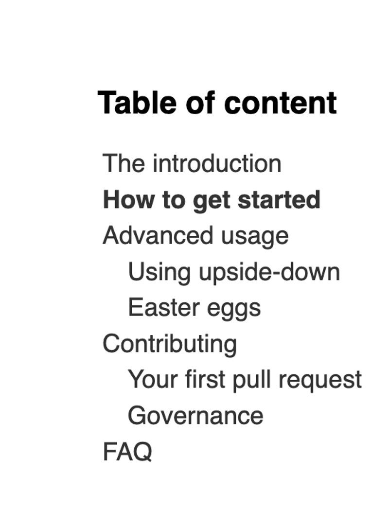
We’ve created an auto-generating table of content component that links to any heading with an ID, and shows us which heading is in view at any given time.
Here’s a working demo as well, if you want to test it out: